Shah & Shah Lawyers – Brand Development
- Brand
- Shah & Shah Lawyers
OBJECTIVE
- Design a logo for a personal injury and immigration firm that is out of the box yet still corporate, strong and simple
DELIVERABLES
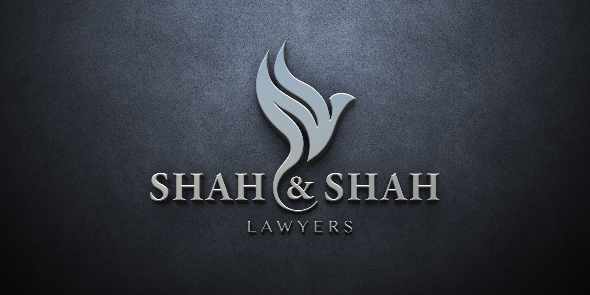
- The chosen logo is a stylized phoenix, meant to symbolize strength and freedom. The wings also contain two abstract S’s for Shah & Shah which also look like flames symbolizing a rebirth when a phoenix rises. A fresh start for a client
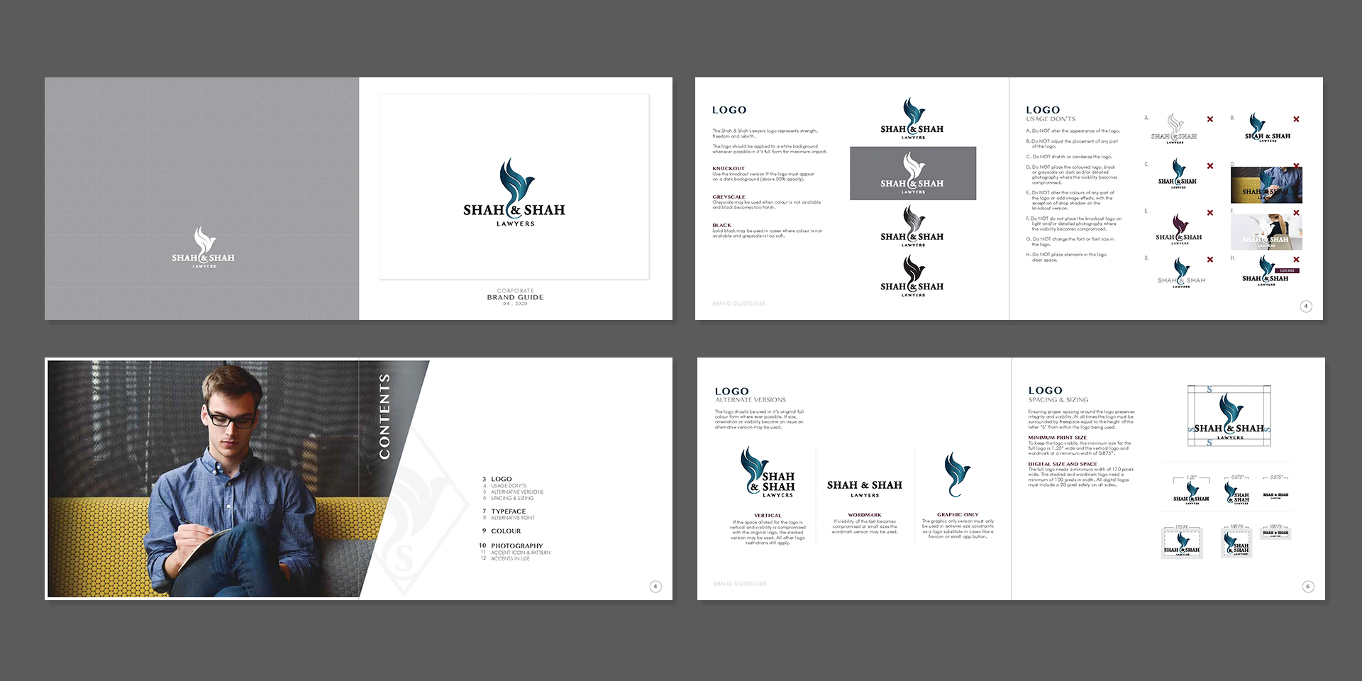
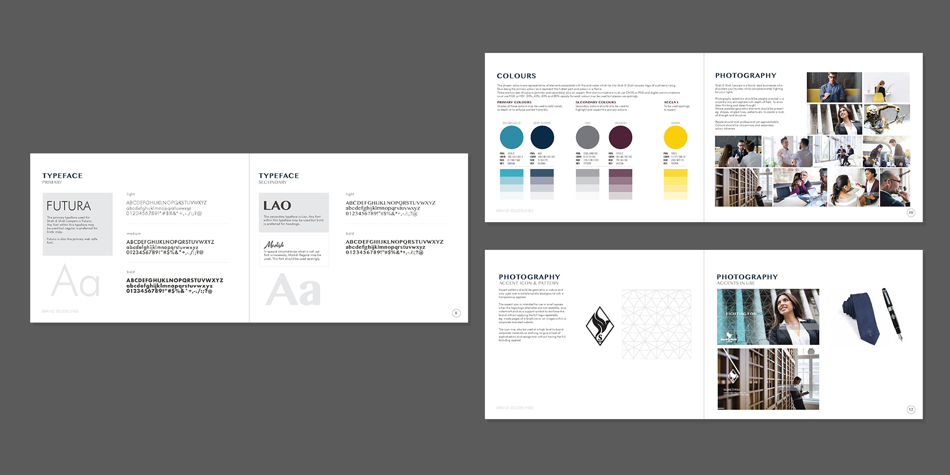
- Brand guide designed with logo usages, alternate versions of the logo, sizing, typography selections, colours and photography styling with icons and accents
- Package with all logo variations in full colour, knockout and black with separate files for web and print
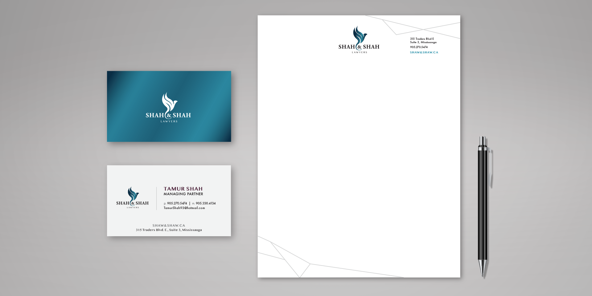
- Corporate stationary carries through the look and feel of the brand
RESULTS
- Complete brand package with all elements designed for the start of a new brand


